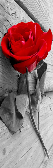
For the first video I imported the clips into premier elements, clip by clip. I then exported the whole video as one. I opened a new project and imported the movie. To get the rose to open and die quickly I had to speed up the video from 6.00.00 minutes to 00.13.00 seconds. This made the rose look jerky and created the effect I wanted. This is shown below
I then explored the effects on Premier Elements; I found no effects that I could use to make the video look a authentic old film. I then looked further and found a effect on Windows Movie Maker. There were several different effects that I could chose from, including different styles from different Eras.
I found two different effects that I liked, these are shown below:
After lots of discussion with our group we decide to use effect 1 this is because it showed the detail of the rose, where as the older effect look away all the hard work we put in when editing each picture.
This is the final edit:

Tuesday, 24 November 2009


DVD disk label rough cut feedback
We asked a few people within our class to give us some feedback on our DVD label to see what improvements we could make. This was the feedback we were given:
Good points:
• The rose looks effective and bold
• The colours work well and reflect the video
• Simple and effective
Bad points:
• The writing on the rose does not look as effective as we originally thought it would
• Everything not spread out enough so looks a bit crowded
As I group we then decided on some changes which we thought needed to be made. We decided the writing on top of the rose did not look effect and crowded the DVD label which made the label look very amateur. We then moved the writing to the sides of the DVD cover to create a more organised label. We decided that the rose did look good in the cover so kept it the same. The use of the three colours creates a look for our band which I like.
Good points:
• The rose looks effective and bold
• The colours work well and reflect the video
• Simple and effective
Bad points:
• The writing on the rose does not look as effective as we originally thought it would
• Everything not spread out enough so looks a bit crowded
As I group we then decided on some changes which we thought needed to be made. We decided the writing on top of the rose did not look effect and crowded the DVD label which made the label look very amateur. We then moved the writing to the sides of the DVD cover to create a more organised label. We decided that the rose did look good in the cover so kept it the same. The use of the three colours creates a look for our band which I like.

DVD cover rough cut feedback
We asked a few people within our class to give us some feedback on our DVD cover rough cut to see what improvements we could make. This was the feedback we were given:
Good points:
• Image is very strong
• Editing is good
• Setting is good for the shot
• 3 images on back page look good
Bad points:
• font on back page doesn’t look effective and doesn’t match the theme
• not enough information
• title covers lighthouse
We then decided as a group to change certain things on the cover to make the DVD cover as effective as possible. We moved the title so that the lighthouse was clear and made the shot look effective. We changed the font for the songs to create a better font which is more in theme with our video. We kept the main image as it proved popular with our feedback.
Good points:
• Image is very strong
• Editing is good
• Setting is good for the shot
• 3 images on back page look good
Bad points:
• font on back page doesn’t look effective and doesn’t match the theme
• not enough information
• title covers lighthouse
We then decided as a group to change certain things on the cover to make the DVD cover as effective as possible. We moved the title so that the lighthouse was clear and made the shot look effective. We changed the font for the songs to create a better font which is more in theme with our video. We kept the main image as it proved popular with our feedback.
Subscribe to:
Posts (Atom)